Growth at all costs: Was that the cause of the recent tech downturn?

Hello, and welcome to my newsletter!
I’m Karim, and every few weeks I tackle questions or problems I’ve witnessed in startups from the very early stages up to late growth stages.. Much of my startup experience has been in leading engineering organizations, but I cover topics outside of engineering as well.
Send me your questions or suggested topics and in return, I’ll try and answer them through a post to this newsletter.
If you find this post valuable, check out some of my other popular posts:
To receive this newsletter in your inbox every, consider subscribing 👇
Over the past few weeks tech stocks have been in meltdown mode with many seeing their valuation drop by 70% or more. The main driver of this steep decline is the raise in interest rates and the subsequent increase in the cost of capital. This in turn has resulted in tech companies, especially startups or recently IPOed ones, to focus more on cash generation versus the predominant mantra of growth at all costs, which has been the playbook de jour for the past decade or so. There’s absolutely nothing surprising in requiring a business to focus on cash generation. After all, the value of a business is derived from the risk adjusted cash it generates over time.
The tech playbook, at least the predominant once since the Great Recession has been to focus on growth, which one hopes can be yield cash flows eventually. This emphasis on growing and scaling incredibly rapidly was driven by cheap and abundant capital. But, is this phenomena truly limited to this recent batch of IPOs? Is it true that the recent batch of tech companies have focused more on growth at all costs? Or is it that these companies “look” similar to tech companies of yesteryears?
To answer these questions, I decided to assess various tech companies focusing on ones who IPO-ed in various epochs of the 2000s. But first, a caveat emptor.
My “analysis” is amateurish. This is a novice’s attempt to assess the financial performance of some companies. The analysis is neither exhaustive nor is it scientific. It’s at best me sampling some companies I am familiar with and reading their financial statements over breakfast and then drawing some cursory conclusions from my analysis. I am also sharing the dataset I used here.
For each company I looked at annual financial metrics at the IPO date along with 2 years pre-IPO and, when available, 2 years post. Some of the companies, especially in the most recent batch had only 1 year of post-IPO data. The metrics I looked at are below
Sales, which is synonymous with growth
Margins, which included gross margins, operating margins and various costs expressed as a % of sales
Cash flow from operations and FCF
Capital structure, namely fully diluted shares and debt
I looked at two batches of companies. The first batch - OldCo - is comprised of Salesforce (IPO 2003), Google ( IPO 2004) & WorkDay (IPO 2012) The second batch - NewCo - are recent IPOs and is comprised of Zoom (IPO 2019), Snowflake (IPO 2020) and Airbnb (IPO 2020)
Google
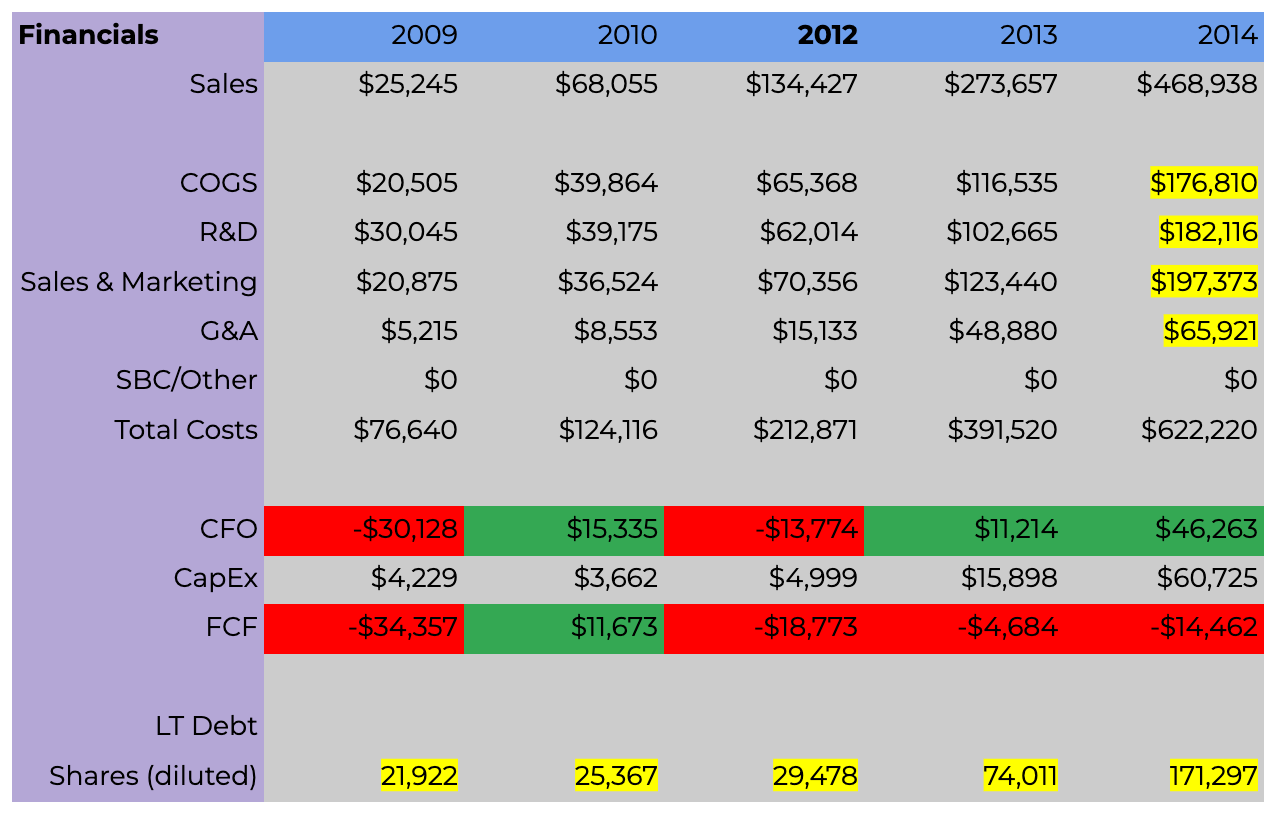
The table below shows Google’s financial metrics, at least the ones I looked at, spanning the IPO year (2004) and two pre and post IPO years. One immediate thing to notice: Google was generating positive cash flow from operations and FCF before it IPOed.
Next, I looked at growth metrics and efficiency. The latter are all expressed as a % of sales. The intent is to see if Google is growing yet able to become more efficient. Generally speaking, for these few early years in Google’s public life, its metrics are spectacular. Sales are growing briskly, costs are also growing, but the company is always able to generate oodles of cash and maintaining a very healthy capital structure. Notice the ever so slight growth in Google’s shares and lack of debt. Google is a beast of a business.
Salesforce
In the interest of brevity, I will only highlight a few of the tables for Salesforce and other companies. The main areas of interest in Salesforce’s case are the following. First, the number of shares outstanding ballooned from ~13K pre-IPO to almost 10x that two years post-IPO. Second, Salesforce was able to generate positive cash flow and FCF, but unlike Google the company attained that at IPO (2003) and not before. Last, notice the huge cost structure in both COGs and sales & marketing. Salesforce was growing very rapidly and fueling this growth by a) spending on S&M and b) minting shares to fuel this growth.
Workday
A similar story to Salesforce emerges with Workday. Workday’s costs and outstanding shares rise dramatically. Workday is able to generate positive cash flows but is unable to generate FCF two years into its post-IPO life. We also notice in Workday’s case the substantial growth and cost of R&D functions, reflecting the dramatic increase of salaries and wages of software engineers post 2010.
The next set of companies - the NewCos - should be all too familiar. They either all IPOed or grew substantially during the COVID-19 pandemic. Zoom being the quintessential example. We’ll quickly take a glance at all three, and hopefully start seeing some differences between them and the OldCos. We should also observe lots of similarities.
Zoom
The obvious thing to note from Zoom’s financials below is 2021. The effect of the pandemic on Zoom’s business was enormous. Its sales and costs in 2021 are substantially more in that year alone than the sum of the previous 4 years. We also see a ~10x increase in cash flow and FCF in 2021. The pandemic was good business for Zoom. Yet again, we also witness the increase in shares outstanding. We should also note the consistent cash generation, well before IPO.
Snowflake
At the time of writing, Snowflake hadn’t wrapped up its 2023 fiscal year and hence I don’t have figures for the second year of its post-IPO life. A quick glance of the financials below shows that Snowflake looks like Workday, albeit with Snowflake’s figures 2-3x those of Workday. Both grew very rapidly, both in terms of sales and overall costs. Similarly, both struggled to generate cash flows, although Snowflake was able to generate FCF in 2022, one year post-IPO. We also notice the substantial increase in shares in Snowflake’s case as well.
Airbnb
At first glance, the first thing that pops out of Airbnb’s figures is their magnitude: billions. But there’s more to the story than just scale. First, Airbnb was able to generate substantial cash flows and FCF pre-IPO. Unsurprisingly the biggest obstacle in its meteoric growth occurred in 2020; COVID-19. We see how sales dropped significantly and as such so did its ability to generate positive cash flows. We also see a new entrant into a tech company’s capital structure: debt. Much like most of the companies we looked at, Airbnb also witnessed a large growth in its outstanding shares. Modulo, 2020, Airbnb looks like Google but with poorer margins.
So where are we with all of this? Can we actually compare the performance of NewCos to OldCos?
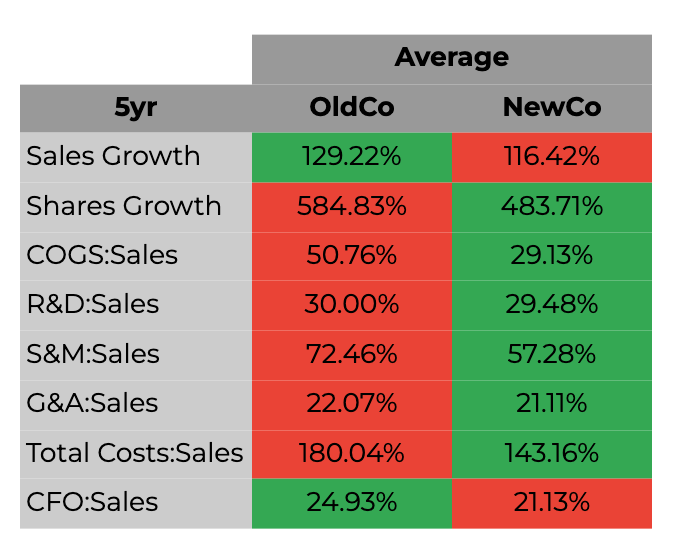
One naive way of doing it is to average out some of the key performance metrics over a 5 year horizon, which is the time span I evaluated these companies on, with the exception for a few who only had 4 years worth of data. The data is shown below with red cells indicating lower than peer and green higher.
So on average, the NewCos appear to be “better” than the OldCos, which is surprising given the recent market turmoil. More surprisingly is how more cost effective Snowflake, Airbnb and Zoom are relative to Google, Workday and Salesforce. The share dilution for NewCos is also on average lower than that of the OldCos, which was also surprising to me. NewCos appear to be healthier than OldCos!
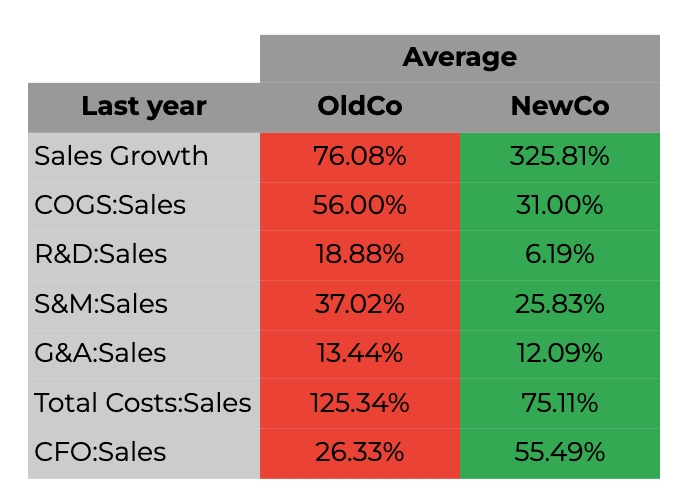
But perhaps what’s at play is averages being deceptive. What if we just looked at the performance of these companies at the last year I tracked, typically the second year post-IPO. NewCos outperform the OldCos handsomely when we compare them to NewCos.
My (very) naive analysis has revealed that the basket of NewCo companies outperformed a peer of OldCos, yet these stocks witnessed a significant draw down. What’s going on then?
The answer lies in valuation and in the change in time horizon for companies to IPO. The most recent batch of tech companies to IPO took longer to reach this milestone than historical peers. Not only that, but they IPO-ed at much higher valuations. I highly recommend the fantastic Mauboussin & Callahan report on the change in the IPO market. I also summarized some of their findings in a previous post - “IPO Dreams: Don’t hold your breath”
The two reasons, I think why this time is different are in the graphs below. The first shows the longer time taken it takes for recent companies to IPO. This in turn means that year two post-IPO for NewCos corresponds to year ~5 post-IPO for OldCos. Google, Salesforce and Workday 5 years post-IPO were very different, and larger, than 3 years prior. I was comparing companies along two very different time horizons.
The second reason is the sheer size of recent IPOs. Witness the chart below showing the valuation of some OldCos relative to NewCos. Practically all of Amazon’s value was created post-IPO. Google’s valuation today is ~50x of what it was when it IPOed in 2004.
It isn’t that these NewCos aren’t profitable or that their profitability profile changes from yesteryears. In fact, my data shows the opposite. What did change and adversely affected these companies are their very lofty valuations. All of the ones I tracked have significantly lower valuations today relative to their valuation at IPO .
One quick way of assessing this delta in valuation is to look at the P/S for OldCos and NewCos at IPO date, with sales (S) based on the next twelve months, since markets are forward looking. Now we see a stark contrast between NewCos and OldCos. At the point of IPO, NewCos were ~3x pricier than OldCos on a P/NTM Sales.
It’s not that all of today’s companies are not profitable or simply throwing money for the sake of growing. Make no mistake many are and have suspect business models, but many others are healthy. However, what they all have in common is they are simply too expensive. Not only are they a lot more expensive, but are also caught in a higher interest rate regime, both of which result in the recent drop in share prices. Nature is healing.


